Creating forms
imperia's form generator provides an easy way to create HTML forms by drag&drop.
Note
Please note that the form generator is an optional feature that must be licensed separately. Your contact person in imperia sales will be happy to provide you with further information.
Note
The available form elements in your installation may differ from those shown here, as they can be freely defined by the template programmer.
How the form editor is implemented in a template is described in the Programmer's Guide.
Laout and functioning of the form generator#
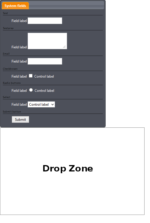
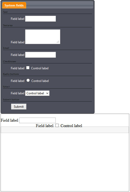
The form generator consists of an EDIT-mode controller with all available form elements and a drop zone in which the elements are inserted using drag&drop.
This chapter gives information on how to work with the form generator.
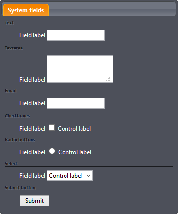
The EDIT-mode controller#
The EDIT-mode controller contains all available form elements. Depending on the integration in the template - provided by the template developer - different form elements may be offered. The following figure shows the most common form elements.
Note
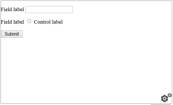
The controller is only visible in the Edit mode. In all other views (Preview, Save, etc.) the container is hidden and only the drop zone filled with elements is displayed.
TIPP
In general, it does not make sense to have two forms in one Edit mode.However, you can simulate forms by writing a postconvert plug-in for inserting them.
- Click on the elements you want to use in your document and drag and drop them into the drop zone.
There are three options for positioning the EDIT-mode controller:
Fixed Position: With this option, the controller is permanently visible and is located above the drop zone.
Pop-up: With this option the controller is hidden until you click in the drop zone.
Slider: This option places the container at the right edge of the page, only the left part is visible. To make it visible in full size, simply click on the visible part.
Note
This option is not supported by all browsers.
The drop zone#
The drop zone is the area of the page where you can place the available elements. It can be any HTML container, depending on how it was defined by your template developer.
Available elements#
The following section describes a standard selection of form elements that can also be found in the usual HTML forms. The number of available elements on your system can vary.
Each form element has a label and other attributes.
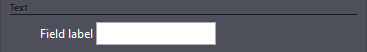
Text: A single-line text input field. You can change the attributes label, placeholder, help text, name, value and ID. You can also make the field a mandatory field.
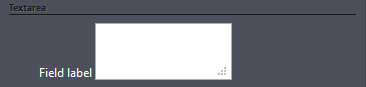
Textarea: A multiline text input field. You can change the attributes label, placeholder, name, value and "ID". You can also make the field a mandatory field.
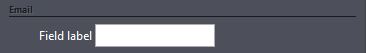
E-mail: A single-line text input field for an e-mail address. You can change the attributes label, placeholder, name, value and ID. You can also make the field a mandatory field.
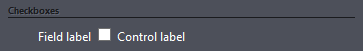
Checkboxes: Checkboxes allow you to select one or more options from a list. You can change the attributes label, name, value and control label. You can also make the field a mandatory field.
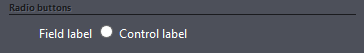
Radio Buttons: Radio buttons allow you to select one option from a list. You can change the attributes label, name, value and control label. You can also make the field a mandatory field.
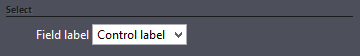
Select: This form field allows you to create a drop down menu with different options to select from. You can change the label, name, value, control label and ID. You can also make the field a mandatory field.
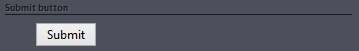
Submit Button: Creates a button to send the contents of the form to the server. You can change the name, value and ID.
Working with the form generator#
Adding a form element#
Click on the form element in the EDIT-mode controller and drag and drop it into the drop zone.
You can insert any number of form elements.
Removing a form element#
Click on the form element in the drop zone and drag and drop it outside of the zone.
Changing the sequence of form elements#
Click the form element to be moved and drag it to the desired position.
Configuring the form attributes#
In the drop zone, click on the desired form element.
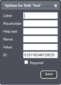
The name of the selected form element is read out in the header line of the dialog that opens.
- To exit the dialog, click on the icon in the header.
Below the heading, you see the attributes that you can change.
- Enter the value of the attribute in the text input field next to the attribute name.
The attribute ID is inserted automatically by imperia, but you can also change it later.
- Click Save to save your settings.
Attributes#
The following attributes can be changed for a form element.
Label: This attribute adds a label to the form element.
Placeholder: The placeholder can be used to display a note for the expected content of the form element. This note is only displayed if the field is empty. Accordingly, it disappears again as soon as a user starts typing.
Note
This option is not supported by all browsers.
Help text: This attribute is only available for single-line text fields. It is displayed on the right side of the input field and indicates the expected content of the text field.
Name: Use this attribute to name the element.
Warning
This attribute must be set for radio buttons. If you do not assign a name, the user will be able to select more than one radio button.
Value: This attribute specifies the content of the form element. It performs a similar function to a placeholder, but the text does not disappear automatically when a new value is entered. If a user does not fill the form element with content, the content of this attribute will be sent to the server.
Note
For the Submit button element, the Value attribute changes the button caption.
ID: This attribute specifies a unique ID for the element. Imperia automatically creates an ID. This ID can be changed if necessary.
Control label: The control label can be set for Radiobuttons and Checkboxes. It determines the text that is displayed next to the checkbox or radio button.
Required: With this option, a form element can be made a mandatory field. Mandatory fields are marked with an asterisk next to the label.
Defining mandatory fields#
If you want to make a certain input field a mandatory field, activate the checkbox Required below the attributes.
Adding a new selection option#
- To add further selection options for a Radiobutton, a Multiple selection or a Checkbox, click on the desired element.
- In the Options dialog, click on the symbol next to the Control label attribute . With each click on another option is added below.
- Specify the value and the element label.
- Save your changes by clicking Save.
Deleting a selection option#
- To remove a selection field, click on the desired element.
- In the Options dialog, click the X symbol next to the symbol. The selection field is removed.
- Save your changes by clicking Save.